

Why the Current Market Presents Very Different Challenges for Buyers and Sellers


A new divide is emerging in the housing market.
In certain states, conditions are starting to favor buyers, while in others, sellers continue to hold the advantage. It all comes down to location. Wondering what the situation looks like in your state?
These three maps illustrate how this divide is unfolding nationwide. Each one shows:
- Darker Shades of Blue = Buyer friendly
- Lighter Shades of Blue = Seller strong
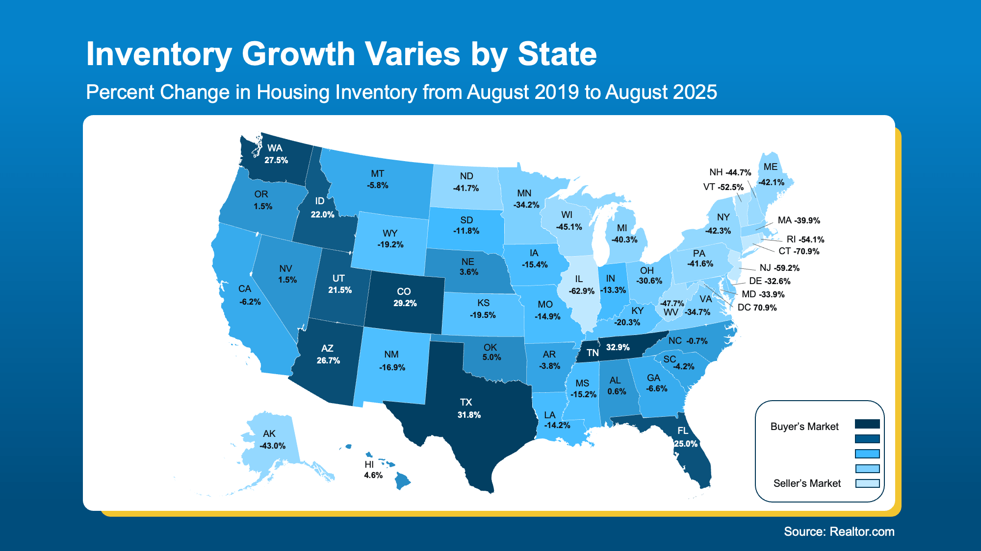
Available Listings Lay the Groundwork
Although the supply of homes for sale has generally increased nationwide, the extent of that growth varies significantly by location — and that plays a big role in determining who holds the advantage in today’s market.
This map, based on data from Realtor.com, breaks it all down:
- The darker shades of blue show where inventory has risen more than in other areas of the country. Buyers here have more to choose from and should have an easier time finding a home and leveraging their negotiating power.
- The lighter shades of blue are where inventory is still low. Sellers are more likely to sell quickly and make fewer concessions.
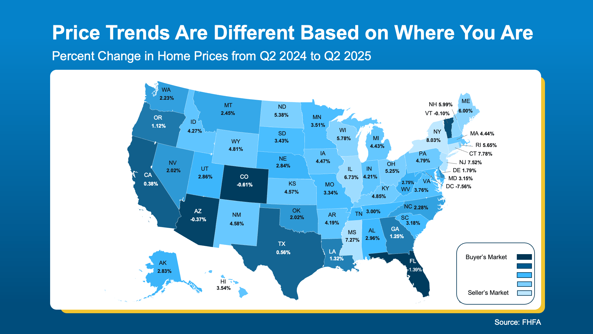
Home Prices Reflect Inventory Levels
The second map shows how home prices are changing across states.
Similar to the inventory map, a clear divide is emerging. Many of the same areas appear in darker blue — a reflection of the strong connection between inventory levels and price trends. As supply increases, prices tend to stabilize.
- Darker blue areas indicate where prices are either leveling off or dipping slightly. With more homes on the market, sellers may need to lower their asking price or offer incentives to close a deal — a win for buyers watching their budget.
- Lighter blue regions represent places where prices continue to rise due to limited inventory. In those markets, seller demand remains high, often leading to bidding wars and driving prices up.
Market Timing Mirrors the Broader Pattern
Here’s a look at how fast homes are selling across each state.
Notice the color patterns? In many cases, they mirror earlier trends — with darker blues concentrated in the southern half of the country. There’s a clear reason for that.
Typically, when inventory rises, homes take longer to sell. So, in areas where listings have increased, it’s common to see more time on market.
- The darker blue shades represent states where homes are sitting on the market longer. That gives buyers more choices and time to decide, while sellers may need to adjust their pricing or expectations.
- In contrast, the lighter blues highlight states where homes are still selling quickly. In those areas, sellers likely feel more confident — and buyers may need to move fast to compete.
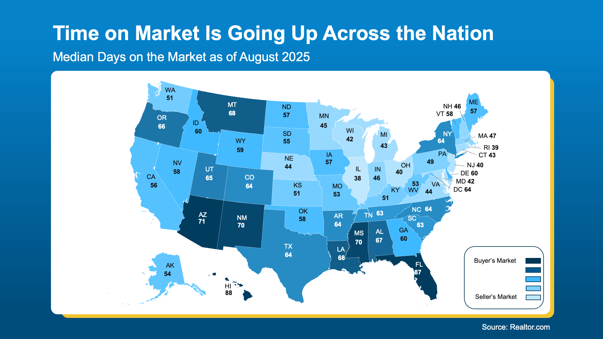
This helps explain why sellers in the darker blue states may feel frustrated as their homes sit on the market, while those in tighter, lighter blue markets are still experiencing quick sales.
How an Agent’s Local Expertise Unlocks Success in the Current Market
The housing market is currently split, with conditions differing greatly depending on your location, your destination, and whether you’re buying or selling. While statewide trends offer some insight, the real impact is felt at the town and neighborhood level. That’s why working with a local agent—who knows the area inside and out—is essential for getting the information that really matters.
Key Takeaways
Curious about the market conditions in your neighborhood?
If you want to figure out whether you’re in a buyer’s or seller’s market, let’s chat. We can review the data together and discuss what it means for your next step.
Categories
Recent Posts


"My job is to find and attract mastery-based agents to the office, protect the culture, and make sure everyone is happy! "